


3 Ninja Tricks for Statistical Analysis
Learning just three equations can make us pretty darn savvy, and help to protect our cookies.


I’m going to share three statistical tricks that can be deployed like throwing stars against confusing, overstated, and sensational headlines. These core concepts can be used to help us understand what’s being communicated and how important the findings really are. The three tricks are:
relative risk reduction
absolute risk reduction
number needed to treat
Most headlines about new clinical studies and health interventions go straight for the most dramatic numbers: relative risk reductions.
New study affirms statin drugs reduce the risk of heart attack by 30%.
Metformin reduces the risk of long Covid by 42% in new analysis.
I admit I do this, too. These relative risk reductions are good for comparing groups of people receiving different treatments to see if one group is doing better than the other. Relative risk calculations are also good for big picture questions like is this vaccine working?
But what does a 30% risk reduction really mean for an individual person like you and me trying to decide on a plan or treatment? It depends on a lot of considerations, with two of the most important being how serious and how common is the problem.
Before getting nervous about math, just realize that we already compare risks intuitively in our heads every day.
Furthermore, I’ve witnessed that kids can often learn mathematical concepts if the problems are presented in the language of cookies. At least it helps me. For example, if you have 100 cookies, normally your parents will eat 30 of them. If you put the cookies in a jar, this slows your parents down and they only eat 15 cookies.
going from 30 cookies eaten to just 15 is a 50% relative risk reduction gained from using the cookie jar
but the absolute risk reduction is less, going from a 30% chance any one cookie will be eaten, down to 15% — for an absolute risk reduction of just 15%. Not as impressive, but significant to a kid nonetheless.
In terms of numbers needed to treat, or numbers of cookies that need to be put in the jar to save just one of them, we have to put about 7 cookies away from our parents. This trick is less intuitive, but sails through the night air like a ninja shuriken. I’ll show you how to do it.
In the above example, which ninja math trick would motivate you to use the cookie jar — knowing that you could reduce “the risk” of your cookies being eaten by 50% or 15% percent? It’s the same with deciding to take Crestor or not. Cookie math. Statin math. All with stealthy ninja skills
So here’s what’s going on in the machinations of our brain in pictorial/equation form. Study these as part of your ninja training.
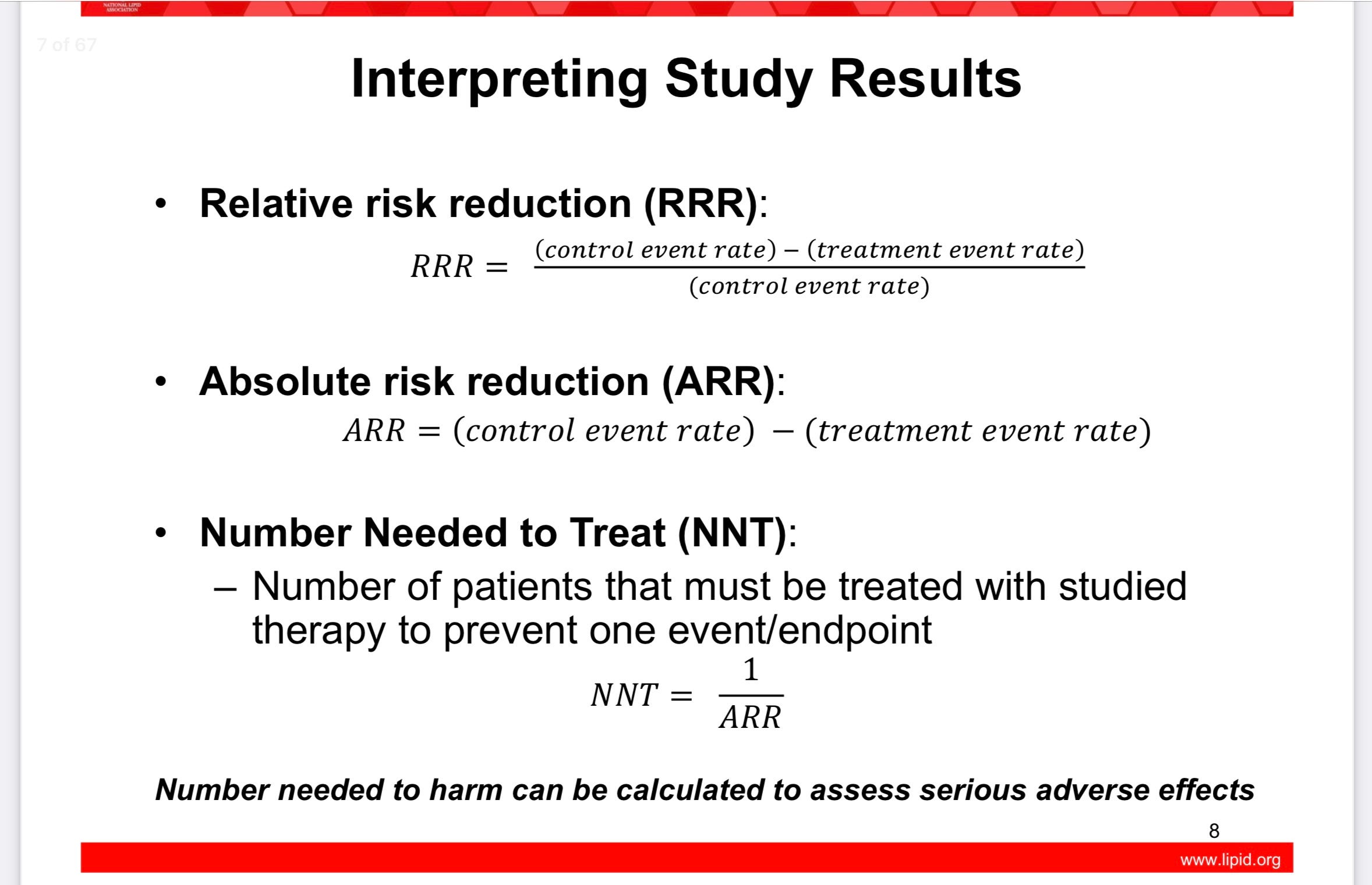
Plug in the cookie numbers and you’ll see the magic. When you’ve practiced enough, you can apply these concepts to clinical trials, collaborations with physicians, and online debunking of sensational claims. It will take practice.
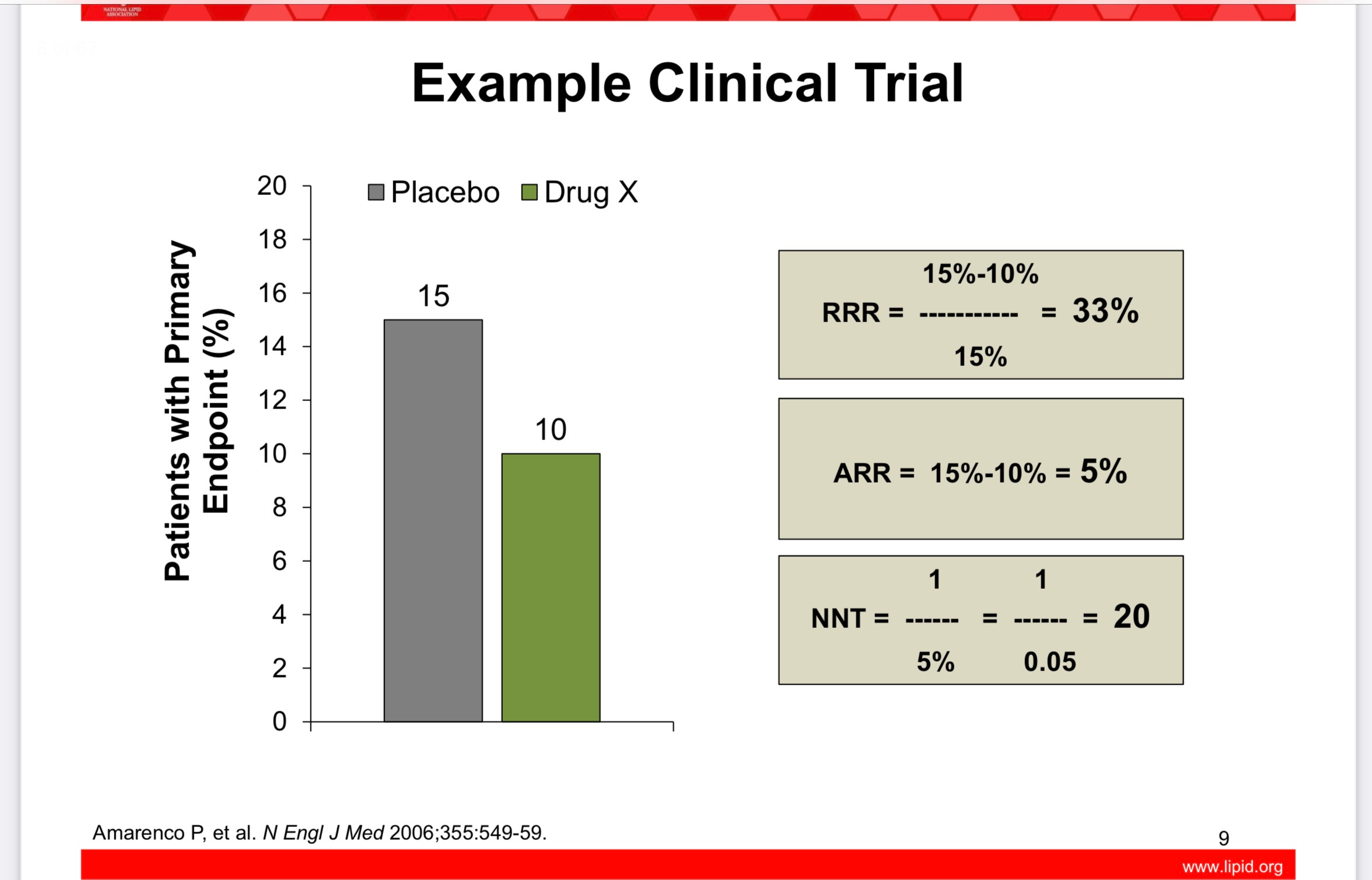
Here’s a slide showing the above shuriken equations applied. In this study, the drug X reduces the relative risk of something by 33%, but the absolute risk is only reduced by 5%, and 20 people would need to take drug X for just one of them to statistically receive the benefit over the studied time period.
Head spinning yet? Ready for a real life ninja challenge?
A great and well known example of how crucial it can be to understand absolute versus relative risk can be found in what happened with postmenopausal hormone therapy. A quote from Peter Attia, MD in his book Outlive:
… one of the most egregious has to do with hormone replacement therapy (HRT) for postmenopausal women, long entrenched as standard practice before the results of the Women’s Health Initiative Study (WHI) were published in 2002. This large clinical trial, involving thousands of older women, compared a multitude of health outcomes in women taking HRT versus those who did not take it. The study reported a 24 percent relative increase in the risk of breast cancer among a subset of women taking HRT, and headlines all over the world condemned HRT as a dangerous, cancer-causing therapy. All of a sudden, on the basis of this one study, hormone replacement treatment became virtually taboo.
This reported 24 percent risk increase sounded scary indeed. But nobody seemed to care that the absolute risk increase of breast cancer for women in the study remained minuscule. Roughly five out of every one thousand women in the HRT group developed breast cancer, versus four out of every one thousand in the control group, who received no hormones. The absolute risk increase was just 0.1 percentage point. HRT was linked to, potentially, one additional case of breast cancer in every thousand patients. Yet this tiny increase in absolute risk was deemed to outweigh any benefits, meaning menopausal women would potentially be subject to hot flashes and night sweats, as well as loss of bone density and muscle mass, and other unpleasant symptoms of menopause…
There are other health considerations with hormone replacement therapy which help to illustrate absolute versus relative risk. Warning: the following is high level ninja training.
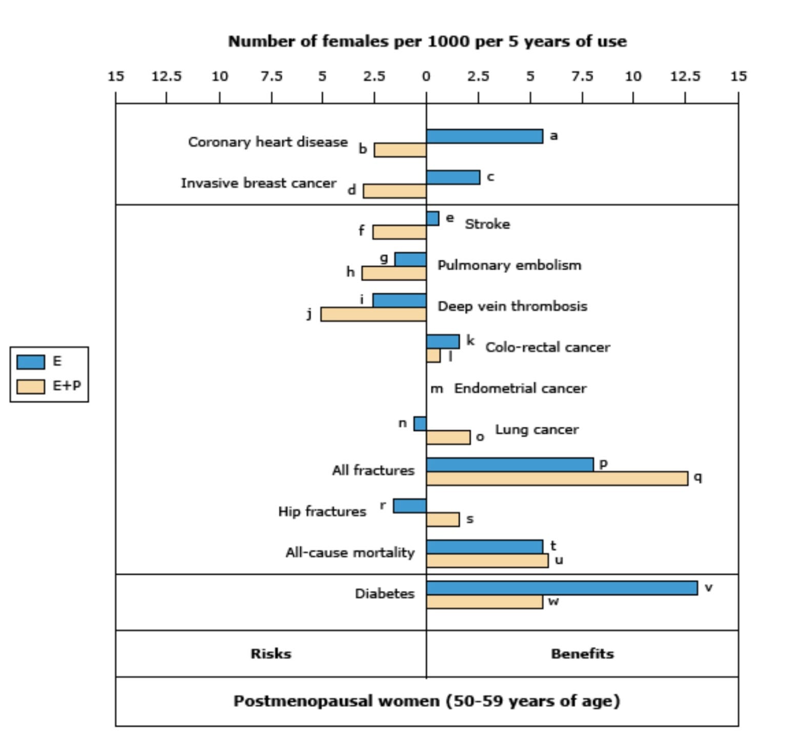
From that same Women’s Health Initiative study, if we look at the subgroup of women who were most likely to benefit from hormone replacement, we find that they are the younger cohort between age 50-59 years old. In this group, all the most risky and beneficial outcomes occur in just an extra 1-15 women per 1,000 treated over 5 years. The following graph from UpToDate is worth practicing your skills with, but first a few primers:
The yellow bars labeled “E” are for patients who took estrogen replacement only. Unopposed estrogen therapy without progesterone is usually reserved for women who have had a hysterectomy. Otherwise it can increase uterine cancer risk.
The blue bars labeled “E + P” are for the patients who took combined estrogen and progesterone (most women).
If the bars go to the right, there is a net benefit.
If the bars go to the left, there is a net risk.
Events are estimated per 1,000 women over 5 years of use. The absolute number of events either way is small.
Remember - this graph and the numbers that go with it are based on symptomatic menopausal women ages 50-59. This group is the one most likely to be suffering, and is most likely to receive benefits (and symptom relief).
Women over age 60 have higher risks of continuing hormone replacement therapy, which is worth a separate post someday!
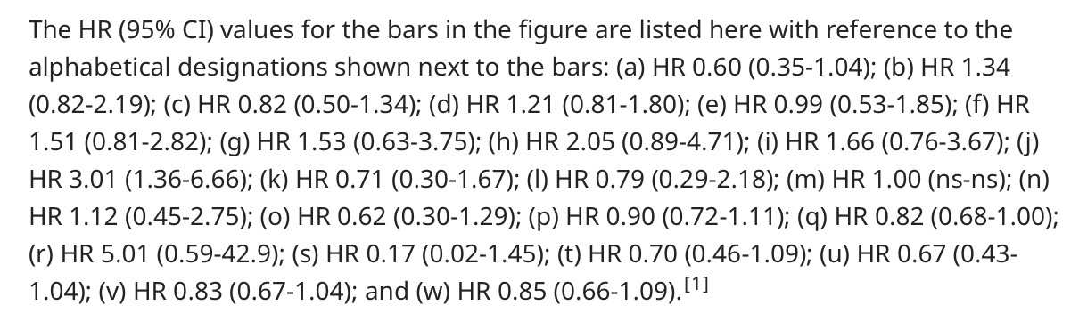
HR stands for hazard ratio, and for our ninja purposes is operationally the same as the relative risk we’ve been talking about.
If we look at the above graph regarding invasive breast cancer risk like Dr. Attia was writing about, we see a mixed picture actually. Women who took estrogen only (presumably because they could skip the progesterone after hysterectomy) had 2.5 less breast cancer diagnoses. Hazard ratio reported in the key was 0.82, which is basically an 18% relative risk reduction of breast cancer!
For the group of women taking estrogen + progesterone (usual hormone replacement) there were about 3 extra breast cancers per 1,000 women treated. That’s an absolute risk of 3/1,000, but the hazard ratio (like relative risk) was a 21% increase in breast cancer.
I’m guessing Dr. Attia pooled these together to get his slightly different numbers. But we get the point. Relative versus absolute risk matters, and we should consider both. Numbers needed to treat helps us make informed decisions with perspective.
At the risk of this post being derailed into a very complicated analysis of hormone replacement therapy, I will include this patient education pdf from UpToDate (I pay for a physician subscription, and these patient education documents are distributed with permission):
https://www.uptodate.com/contents/menopausal-hormone-therapy-beyond-the-basics
Let me know if you would like the pdf version emailed to you.
Completion of ninja statistics training for today 🥷
If you only come away with broad strokes from this session, know this:
When sources talk about risk reduction, it is imperative to know what kind of risk they are reporting. Chances are they are talking about relative risk reduction. It’s more juicy, worth reporting, and influential. It’s not necessarily bad or manipulative, because relative risk calculations are a good way to discern what’s helping and what’s harming. Absolute risk reductions, and the advanced ninja trick of flipping these on their head to get numbers need to treat, can help put things in perspective. The best reporting out there, and what I often try to do in my Examined posts, digs into the relative and absolute. I’ll keep trying to do this from here on out, too!
And finally, parents always win with cookies. 🍪 We have eyes in the backs of our heads, an intuitive sense of math that keeps cookies flowing into our bellies, and ninja like skills when blaming the other parent if our child’s eyes are welling with tears from lost cookies.
Take good care out there.
Hi Grace - I messed up my reply to your comment so I’m going to copy and paste it, and my reply, below. Thanks for stopping by :)
Comment - This is so chock full of good stuff I need to come back and comment later, so just a quick thank you! Practicing my ninja moves with the next headline I see, and guessing I’ll need to click on the source study and dig a little past the top line numbers reported. The WHI/hormone replacement graph is stunning. Such treatment abandonment likely a result of fear and potential for lawsuits rather than fair risk assessments?
~
Me - I think you are correct - it’s sad but doctors cannot rely on evidence based protection against malpractice claims, judged as we are by juries of laypeople. It is a lot easier for the lawyers we see on billboards to appeal to emotions, outrage, and dollars than any fair assessment of risks/benefits/chance.
I hope the relative versus absolute risk idea is helpful. I’m certainly not the first to write about it, but I might be the first to invoke ninja training to illustrate how difficult yet stealthily effective this math can be 😉
Cleverly done! I have to say, despite my advanced degree eddication, I most often get cross-eyed when looking at stats and charts--but as you note, the big picture is useful on its own.
In terms of absolute vs relative risk, I'll offer a story: a friend who hates to fly related a long ago exchange with her mother (midwestern, so using the euphemism "to go"):
Mom: "C, flying is really safe. it's really, really unlikely it's going to be your time to go."
"C, replying: "Yes, but what if it the pilot's time to go?!"